3.31.2011

THE RUG THAT WAS NOT TO BE

LE TAPIS QUI NE DEVAIT PAS ETRE.
Some of you may remember my post where I described the rug I had ordered in Tangier Morocco. I was hoping the weaver would do as good a job on the final rug as he had on the sample piece he had made for me in 3 days. 
Well, it is NOT to be... 
He did make the rug, that's the good news. 
The bad news? It looked AWFUL. The final version, a 3m x 2m rug (roughly 6'x9')  was all wrong. The pile was much longer to make up for the fact that he had skimped on the number of knots (the density) required to follow the sample. It looked like some old rag dragged out of the sewer. Really. 
That's not all the bad news. I asked for the rug to be made again, according to the sample. The answer to that? For that quality I needed to pay twice as much as originally quoted. 
Needless to say I asked that my deposit be transfered to the GREAT rug my sister had ordered. That one was stunning.
And that was that.


One mishap does not necessarily mean that rugs are impossible to make in Morocco. Quite the contrary of course. I suppose creative freedom works best, if the beauty of rugs made by beginners in the Atlas mountains with left over scraps of wool is any indication. Judge for yourself.

all rugs from blog.nazmiyal.com

These are many decades old and yet so modern! 
Creative freedom and creative genius. Perfect combination.


au revoir.


3.30.2011

THE MANTLE'S DISAPPEARING ACT


QUAND LA CHEMINEE JOUE A CACHE-CACHE
via great interior design

elle decor

image xjavierx

via vi.sualise.us

katy elliott*

There is something so subtle about a fireplace mantle that disappears into the woodwork, so to speak. What is left is the frame and some details and moldings, the true basic essence of the mantle. It's like eating yogurt without sugar or fruit. You get the real taste. 
It's a big plus only if the yogurt is great. 
Just like a great mantle. 
I know the comparison is a bit of a stretch, but you get my point.


au revoir.


* By the way, go to Katy Elliott's web site: I just discovered it; she is renovating her house and her posts showcase some of the best American design I know out there.


3.29.2011

SEARCH FOR ART IN THE EVERYDAY


CHERCHEZ L'ART DANS LE QUOTIDIEN

KANOR

"Graffiti and graffito are from the Italian word graffiato ("scratched"). "Graffiti" is applied in art history to works of art produced by scratching a design into a surface..."- wikepedia
"With the development of large cities and urban areas after the war, in the second half of the 20th century, gangs would mark public property and walls with their gang names, titles, and tags – this would mark the gang’s territory. By the end of the 20th century graffiti, or tagging, was no longer restricted to gangs, but spread to ‘artists’ who began to leave their tags in order to create a ‘name’ and reputation as a graffiti artist" -art history guide.


DAIM
 3D graffiti. dynamic trompe l'oeil

BANSKY
 message graffiti. public irreverence

BEN SLOW
custom graffiti. museum quality
A piece of Graffiti art on the 'Icon Wall' at the Royal Albert Hall on June 15, 2009 in London, England. Photo by Dan Kitwood/Getty images Europe.

LOUIS VUITTON
fashion graffiti.  legitimacy and commercialization 

JIM DENEVAN
sand graffiti. ultimate ephemera


MOOSE
 reverse graffiti. welcomed improvement
Graffiti artist Moose "cleaned" San Francisco’s Broadway tunnel's walls with Green Works' plant based cleaner and large stencils. "Caked with dirt and soot...it set the perfect canvas to create a truly beautiful work of art"- Green Works.


"The world of reality has its limits; the world of imagination is boundless."  Jean-Jacques Rousseau


au revoir.


3.28.2011

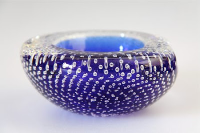
MURANO GLASS BOWLS


LES BOLS DE MURANO

To say that I love Murano glass is quite an understatement. Funny that the two kinds I like the best are totally opposite in style, in feeling and originate from such different times.
I swoon over every 1950's chunk of heavy amorphous glass yet I am equally smitten with the delicate wine and water glasses and their dangerously fine ornate stems.
On a buying trip to an Antique store with one of my favorite clients last week, I spotted a group of Venetian bowls on a stunning classic bureau and immediately thought that this was just the ticket for her living room coffee table. A little 50's, albeit very "classic" 50's, would perk up the room and give it an instant shot of modernism. She totally agreed and we were happily carrying out our treasures a few moments later.
I can only wonder at the talent needed to produce these pieces, at the patience and the dexterity and at the creativity obvious in every bubble, every gold or silver speck, every layer upon layer of color.

How can one not marvel at the subtlety of this smoky, foggy, creamy, precisely sliced slab of clear glass?
What artistry.
images antiquehelper, modernistglass, afterglowretro, bigashtray, theendofhistorystore, 20thcenturyglass


au revoir.


3.26.2011

I CAN SEE CLEARLY NOW, THE RAIN IS GONE...


Enfin la pluie a cessé...
I was gone for exactly 17 days. 
It rained in Paris. 

It rained some more in Tangier...  

and it rained again in the south of France.

It rained ALL 17 days except 2 half days when it was gray to slightly luminous at best.
Yes, we did see some fabulous sunshine. 
In Paris. 
On the drive to the airport on our way home.

It was dry but cold and dark on my arrival at JFK.
 Eager not to disappoint, the rain did not show up in New York the next day. 

IT SNOWED...


Is spring ever coming? Does anyone know spring's ETA? 
I sure don't.

After this short and dismal weather report and as today was cool but sunny, I wish you a


bon weekend.


3.25.2011

THE EIFFEL TOWER EVERYWHERE


La Tour, partout
Just before I left for France two weeks ago, I was asked by a kind blogger to bring her back an Eiffel Tower. 
So sorry I deleted the email, so maybe if you read this post please identify yourself again, if you wouldn't mind.


In any case here it is.

 Or are, as it were.
I brought back these two for you, seen in windows in St Germain.
Even the Parisians love their Tour.


au revoir.


3.24.2011

YIN and YANG


LE YIN ET LE YANG
Architect Ricardo Boffil is a master of it

Paola Navone can do it better that anyone

The Galerie Artcurial on the Rondpoint of the Champs Elysees in Paris is a perfect example

Of course the GENIUS among them all is I.M. Pei and his Pyramide du Louvre

But mixing an Hermes scarf with a hip look illustrates it perfectly as well

It is my modus operandi in interior design.

What am I talking about?
The art of mixing the old and the new, of creating contrasts that can raise eyebrows and engender disdain, of proving that the past we must respect and embrace, classic splendor and all, can live harmoniously with the present we should adopt enthusiastically, jarring quirks and all.
There you have it: my design philosophy in a (very concentrated) nutshell. So to speak.

images souffle organique, lookbook.nu, style-files,finding shibusha, mes petits papiers, design-dinterieur, style box

au revoir.


3.23.2011

PARIS, LE BON MARCHE


LE BON MARCHE

My very first "real" job was styliste- fashion consultant- at Le Bon Marché. As a matter of fact I was the left bank department store's very first fashion consultant. And the store needed all the fashion help it could get! However, and to put it mildly, I met some resistance from some most of the buyers who, very set in their ways and resenting any advice from a 20-something newcomer, would kindly and very visibly deposit my trend reports in their wastebaskets upon receiving them. Very destabilizing for a young designer just fresh out of fashion design school, eager to help and naively convinced of her usefulness... an education in one "easy" lesson. 
With the help of the younger buyers, the head of buying and my stubborn ego, things got better as time went by. I can't say I single handedly revolutionized the store's image. Not even close of course. That came much later when the store was bought by LVMH and its new CEO Philippe de Beauvoir, a colleague of mine from my later days in Le Printemps Group, entirely transformed the image, branding and interior architecture of the store. 
These images, from the 40's and some 70 years later, say it all wouldn't you say?


Among the most spectacular changes, Andrée Putman's stunning escalators are a must-see when in Paris.
The store is now much more high end than in my time and it attracts a very select clientele from all over Paris and especially the 6th and 7th arrondissements around it with its trendy fashions and luxurious accessories, large home department, a fun haberdashery floor (yes, in 2011!) and a wonderful book store.

My very favorite part of the store has to be La Grande Epicerie Paris, a large upscale market, something like a huge version of Grand Central Market at Grand Central Station in New York City.

Everything you can dream of is on offer including great fruit and vegetables, a million kinds of loose teas presented in tall gray canisters, mouth watering pastries and delicious ready made dishes from the traiteur counter.

On the top floor over La Grande Epicerie, a simple but refined lunch inside or on the terrasse at the Delicabar designed by architect Claudio Colucci, a quiet relaxing outdoor spot, will be just the thing after a harried shopping day.
images septentrion, le bon marche, trip advisor, juste a cote, the paris traveler,collucci architecture

Maybe this time around, Le Bon Marché info will not go directly into the "recycle bin"...

au revoir.